

It’s time to get
Unkink’D
For the founder of Unkink’d, function is just as important as fashion, which is what led her to develop a revolutionary, posture-correcting garment. She sought to develop a brand which was as stylish and impactful as her functional, athleisure products. We worked together early on to develop a brand strategy which included a new name and visual identity.
The Problem
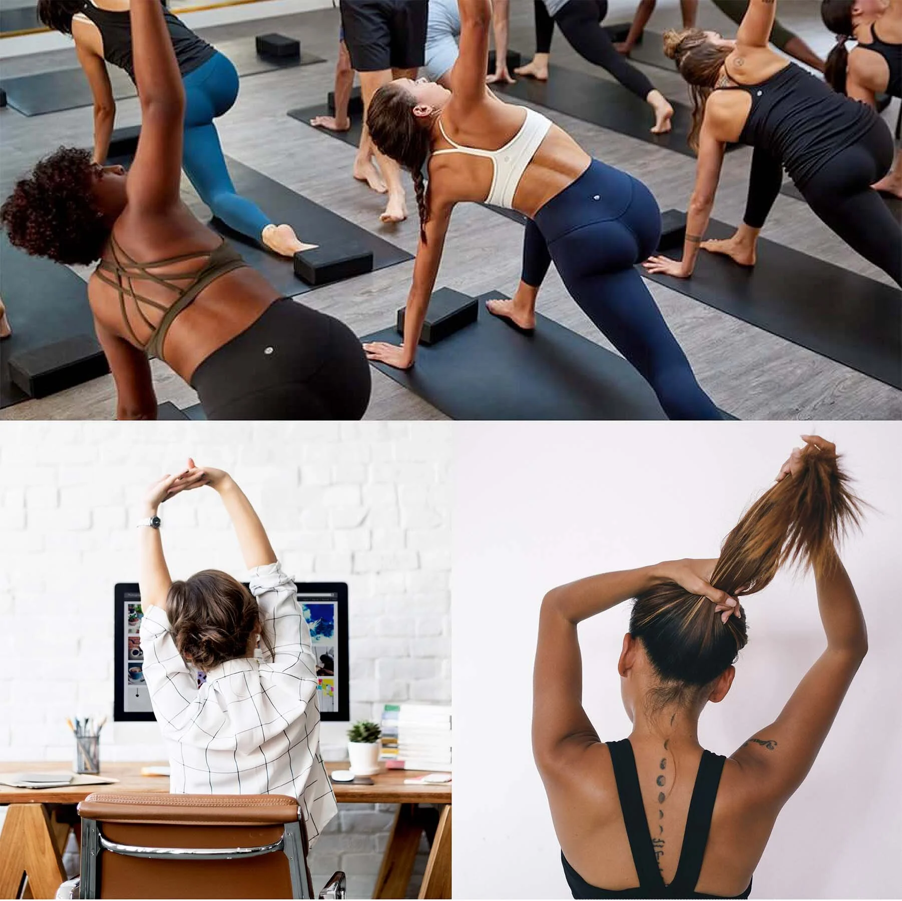
Many people suffer from back and neck pain stemming from poor posture while we hunch over our desks at work or exercise with improper form. Many posture-correcting devices are cheap, bulky, unaesthetic, and uncomfortable. Inspired by her own struggles with back pain, the founder of Unkink’D attempted to design a garment which would correct the wearer’s posture and could be worn both at the office and at the gym. The result was an athleisure-style body vest which combines the functionality of posture harnesses with the fashionability of sports bras from Lululemon or Athleta.
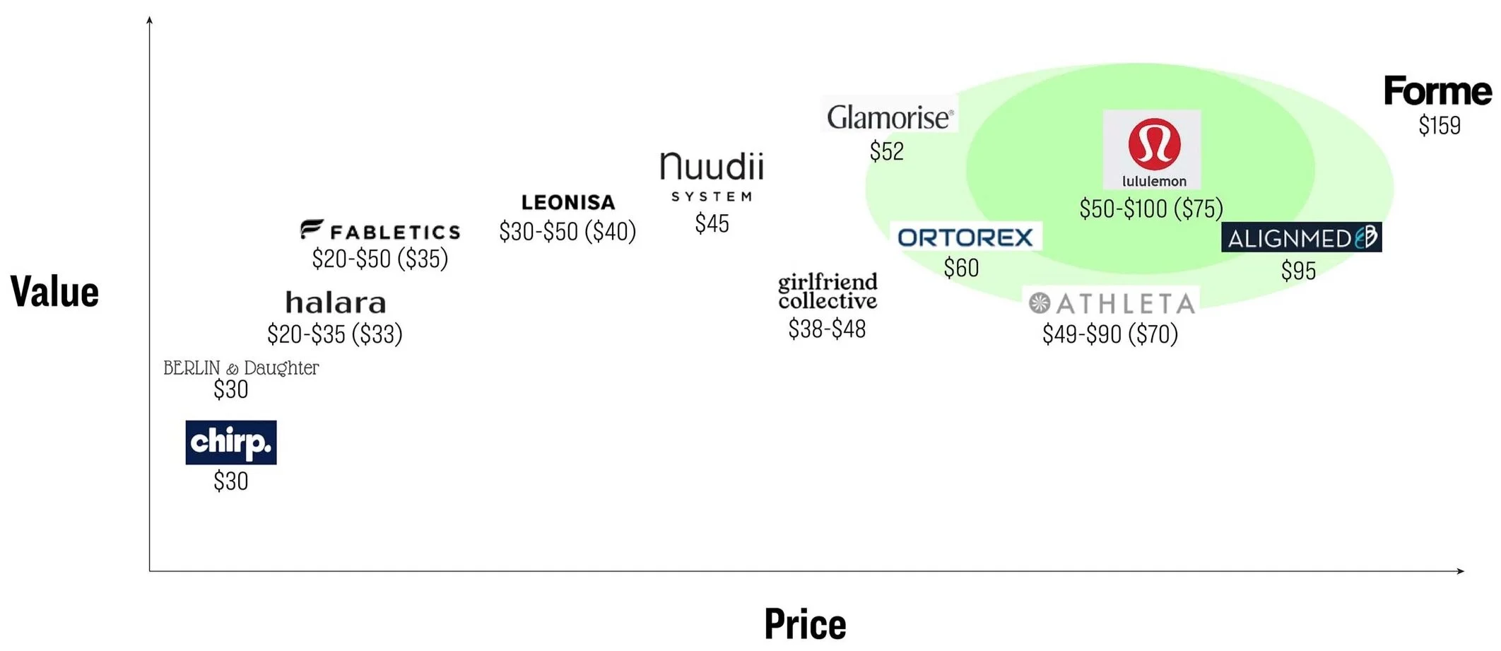
Here you can see where Unkink’D is positioned in terms of price and value against its competitors, indicated by the highlighted regions.

What’s in a name?
As part of this branding project, we worked with the founder to come up with a name for the brand. Combining our market, consumer, and trademark research with creative brainstorming exercises, we ultimately decided that Unkink’D perfectly encapsulated the brand’s personality and purpose.
When you stand up straight, you feel better, stronger, more confident. Like a trip to the chiropractor, the Unkink’D body vest makes you feel loose and relaxed and, well, unkinked. The name is fun, quirky, unique, and, in a word, describes the experience of wearing this clever garment.

The Mark
We wanted to design a mark that could stand alone to symbolize the brand and which could be used as a stamp on the apparel, similar to competitors like Lululemon, Fabletics, and Athleta.
The loop within the “U” symbolizes a "kink” and the simple, clean, modern aesthetic is approachable, trustworthy, and can be scaled down to a tiny tag and still be recognizable.


Unkink’d is currently raising funding and is expected to hit shelves late 2021.
Questions about branding?
Drop us a line! We’d love to chat.